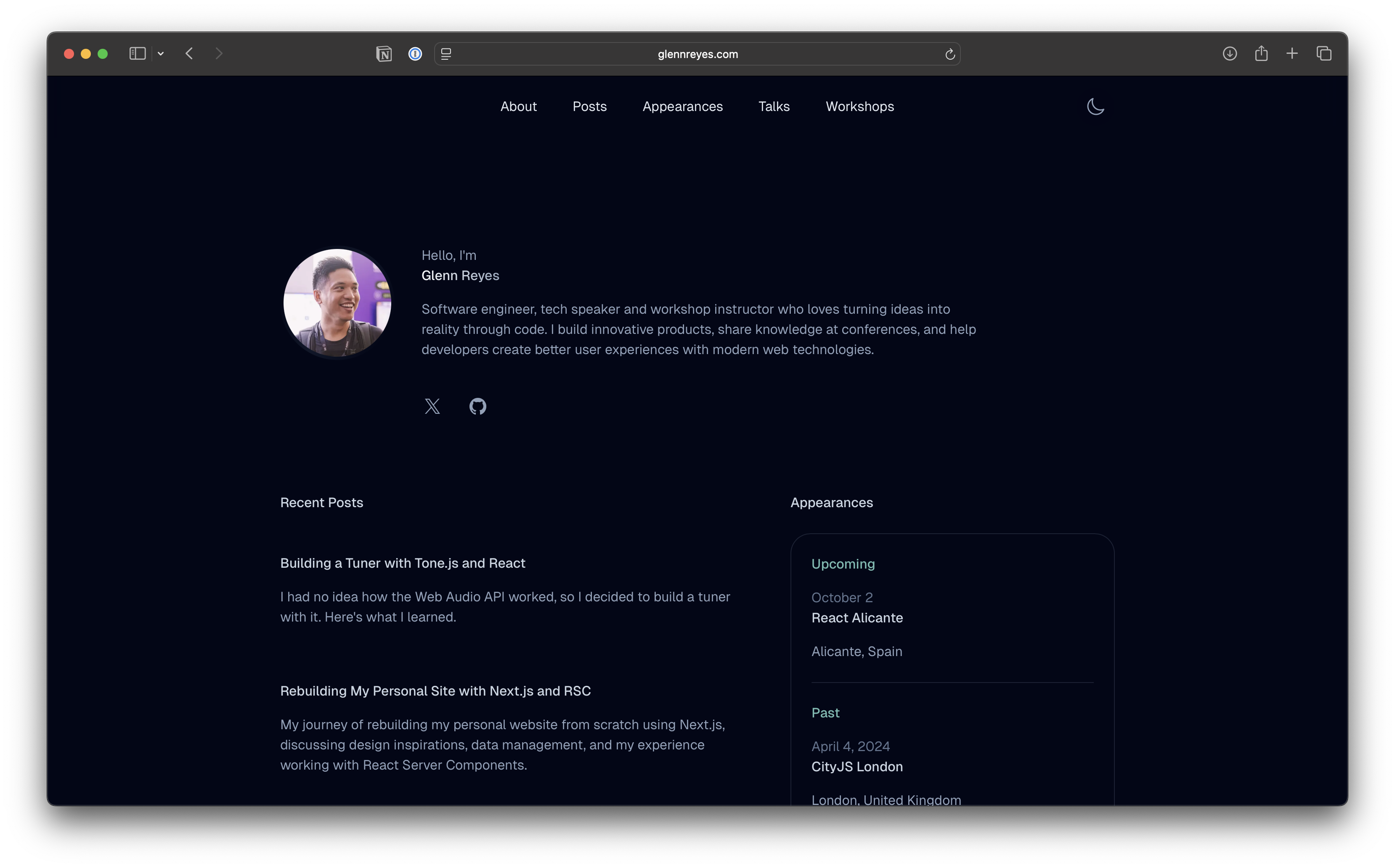
One Font Size
I recently did something unusual on my personal site: I made almost every piece of text the same font size. No oversized headings, no tiny captions. Just one size everywhere.
It sounds like a small tweak, but it completely changed the feel of the site and how I think about typography in web design.
Why I Chose One Font Size for My Website
Design usually relies on different font sizes to create hierarchy: big titles, medium subtitles, and smaller body text. But on my own site, I wanted something calmer. Instead of a corporate or marketing look, I wanted it to feel more like a personal journal.
Using a single font size gave the site a rhythm that feels simpler and more intentional. It doesn’t shout with big headings. It just flows while being pleasant to scroll through.
Benefits of Minimalist Typography
Switching to one font size surprised me in a good way. Here’s what I like about it:
- It’s minimal. Everything feels balanced, without text competing for attention.
- It feels confident. The words carry the weight, not the formatting.
- It changes how I write. Without relying on big titles, I focus more on structure and clarity.
In short, the design feels cleaner, more personal, and more human.
Challenges of Using the Same Font Size Everywhere
Of course, this approach has its drawbacks:
- Scanning is harder. Without larger headings, readers can’t skim as quickly.
- Navigation can blur. Menus and content risk looking too similar.
- Accessibility matters. One size has to be chosen carefully so text is easy to read.
So while it works for a personal blog, I wouldn’t recommend it for every site. Especially ones that rely on quick navigation or complex layouts.
What I Learned About Web Design
This experiment taught me that design isn’t always about adding more. Sometimes it’s about simplicity. Removing font-size hierarchy forced me to think about whitespace, rhythm, and tone.
It reminded me that good web design is about intention. For my personal site, one consistent font size feels calm, clear, and aligned with who I am.
Closing Thought
Design choices don’t just change how a website looks. They change how it feels. By using a single font size, I made my site less like a presentation and more like a conversation. And that feels right for me.